Tuesday, December 1, 2009

Blog Assignment #5 - Self Evaluation

1) Most Significant Accomplishment:

I think my most significant accomplishment in this class was my final project. I chose to do a movie poster mixer, bringing together a chick flick-and guy pick. I made the movie poster for "When Dirty Harry Met Sally." To challenge myself instead of starting with one movie poster and pasting in images from another I started from the ground up and built the poster. This included making several layer transparent gradients to set up the background, doing extreme modifications to a shot of the New York skyline to match the original poster, making photos taken 20 years apart look the same, and mimicking text styles and fonts with custom messages. This project brought together all of the photoshop knowledge I gained this quarter, and I think that more than anything thing else the finished product looked like an original poster, not a Frankenstein stitching of several works. I was quite proud of this comical work.


2) Most Challenging Learning Experience:

My biggest challenge for the quarter was without a doubt the project I chose for blog entry #2. We were challenged to learn a new skill by doing a tutorial on Worth 1000. I picked one that I thought would be fun and fairly easy to learn...but I was wrong. The tool I wanted to learn was masking, and at first I couldn't get it to work at all. It was a key step in the process. I got half way done and just had to mask and apply filters, but the process was many hours from done. I had budgeted 1-2 hours to do this assignment, but in the end I sat at my computer for 8+ hours with lots of spots on the desk from banging my head. I can happily say now though that I understand the mask tool and use it often. The struggle was worth it, and even though it took forever, it was a fun project.


3) Developing Meaning:

To look at how I worked to develop meaning I will examine my midterm project and quiz #4. In quiz 4 we were challenged to make mix the movie posters from a chick flick and a guy pick as described for the final project above. The real focus was "bending" the gender of one of the movies to submit to the gender of the other. I made "Breakfast at the Godfathers" with "The Godfather" and "Breakfast at Tiffany's" I studied the posters and came to the realization that for the chick flick the colors were bright, text curvy, and the mood happy. For the guy flick a dark mysterious theme was used to show illegal deeds and death. I worked to morph the elements from B@T to conform the darkness of the godfather. If Tiffany we're to meet with the Godfather you can be sure the mood would not be happy! Voiding the color and adding shadows did the trick quite nicely!


For the Midterm project I took a complete different approach to convey my meaning. Our class "Big Idea" was pleasure, and my piece was entitled "The Struggle for Pleasure." I looked deeper into pleasure than pretty girls, football, and sunny days on the beach. I considered the pleasure we get from hard work and dedication to our passions. For me that's the OSU Buckeye Bullet race car. My collage showed all of the students slaving away for 5 years to build the worlds fastest hydrogen vehicle (www.buckeyebullet.com). I began in the top right corner and spiraled the pictures around in chronological order to tell the story of the design, build, and racing of the car. The story ends in the center with a large picture of the car as is say just after going 302 MPH and breaking the international record.


Blog Assignment #4 - Final Project Research

1) Artist Statement Draft:
For the final project we were presented with several options. I really enjoyed making the movie poster in Quiz 4, so I chose to go that route for my final. To begin I looked up the top 50 chick flicks and top 50 guy picks of all time. From there I listed them next to each other and brainstormed about 20 clever titles. I then searched the Internet for movie posters and looked for the right source material to make a good project. So far I've found several good candidates for layout, but am struggling to find high enough quality images. I plan to continue to develop this idea and come up with a clever merged title that has two child poster that merge well together. I will use all of the skills developed over the past 10 weeks to complete the project.

2) Influences:
I am not really doing a "big idea" or theme so I don't directly have concept influences, but over the quarter I have had many influences that have helped to progress my photoshop skills. The first I'll mention is my sister. She is in OSU graduate in Art and Technology and a pretty talented Photoshop-er. Her work and tips are a constant inspiration. Next would be the tutorials we were pointed to in blog 2 at Worth 1000. It was really neat to see all the people giving free tutorials, and there were SO many skills I wanted to learn. I wish I could spend all day playing with new techniques. I hope that my project turns out to be a quality piece of combination art that brings a smile to peoples faces. Why turn a guy pick into a chick flick unless it will make some people laugh!


3) New Tool:
I have been playing with the mask tool a lot out of class. I'm sure it will pop up in my final project several times. I've found that the quick mask tool is great for doing a lot of modifications that use to take me much longer.

Thursday, November 5, 2009

Blog Assignment #3 - Artist Review

For my first artist I selected Codrin-Gruie Cantemier. To me his work defines our big idea of pleasure. I use artist in quotes as CG would be offended to know I called him such. CG is an incredibly talented automotive designer (PhD in Engineering) that I have had the privileged to work with. Some of his high level concepts for advanced designs and hybrid and electric power-trains have inspired my future work in Mechanical Engineering. I consider CG's work as nothing short of true and pure art, it just happens to have some technical merit as well!! I contacted CG directly to get some of my favorite samples of his work. See them below:


Concept for a future Corvette, the C8 Maria


A hybrid sport-sedan concept


An electric semi truck!!!

CG's work makes me think about the future of the automotive industry. You see ideas of advanced aerodynamics, power-train, and style. It is exciting to me to think of being a part of the future of the automobile. From this work I learn to challenge the existing norms of design and push to the truly unique. It is the original concepts that make his work so special.


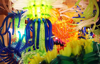
For my second artist I chose Jason Hacksonwerth. Jason makes amazing sculptures.....all out of balloons. Before discussion more about Jason's tak a look at a few examples at below and even more at Jason's Site.


I think what really inspires me about Jason's work is that he uses such an unusual material. He takes the idea of a balloon animail to a new extreme. His "big ideas" center around presenting creatures - mainly aquatic, and an interesting and larger than life medium.

If you're a member of our art ed 252 class you might be thinking "how does" Jason's work fit into our final project? I'll be the first to admit it's a bit off the wall, but I think what I've really learned from Jason is to not submit to standard art. He as created a completely new medium, and is being recognized around the world for his work. I'm sure many laughed at the idea of making a career other than a clown out of balloon animals, but Jason reminds us that sometimes the craziest ideas turn out to be the coolest.


Tuesday, October 27, 2009

Blog Assignment #2 - Tutorial

For this assignment we were challenged to complete a tutorial from Worth1000.com
I looked through hundreds of interesting lessons, but in the end found one with several tools I wanted to learn/perfect. I a tutorial called "Turning people into statues." Check out the tutorial here! It seemed at first that it was within my skill level to do quickly, but in the end I spent more than 5 hours, mostly learning to use the mask tool! It took me a while to catch on to some of the tips and tricks that the author assumed we knew.....Anyway getting down to it:

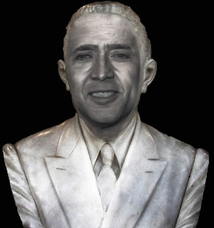
The goal of this tutorial was to take a picture of a person and transform it into a statue or bust. As suggested I started with an existing bust, and found a source picture of a face to blend on to it. I choose Nicholas Cage. See below the beginning photographs.


The next steps were to overlay Cage's face on the statue, transforming it to the correct size, matching hairline, and then masking off all of the parts of his face that wouldn't be needed. I had hoped to do this with simple selection, but as the later steps of the tutorial really forced you to use mask. Again, making this work properly for me took 75% of the time! See the masked overlay below. It was important to put the base bust over top in a transparent mode so Cage's face could be extremely accurately masked. The following picture shows the mask applied and Cage's face overlaid on the base bust.


The next steps involved blurring most of the features to smooth to a stone look, and then applying a great deal of filters, adjustments, and translucent color overlay layers. These various adjustments and color layers allowed the color to be toned down to a constant smooth look, while maintaining the natural reflections and shadows, making the features pop out. Also at this stage some of the major features including eyes, ears, and chin were adjusted.


For the final touches (and what really makes the image) several top layer adjustments were made including contract/brightness, hue/saturation, and custom curves. Combinations of these controls were experimented with for a great deal of time until the final image below was produced.


This exercise proved to be a great learning experience, and added many tools in my photoshop tool box! I still have a long way to go, but each assignment makes me more comfortable with the software.

Wednesday, September 30, 2009

Blog Assignment #1 - Computer Artist Analysis - Jennifer Cooke

The artist I chose to study was Jennifer Cooke. I find her work particularly interesting as she uses both computer animation and actual trade skills to create her art. For nearly each work she has made a computer animation to show the art in fantastic color and lifeline imagery, but then goes the next step and builds the actual pieces. Her mediums focus around glass and wood. Her artwork can be found at http://www.jenamate.com I have shown a few still selections below, but to truly appreciate the work it is necessary to visit her site and view the videos.


In Non Completion Continuum shown above the denotations of an hour glass filled with sand jumps out. Upon watching the video of the installation you find that the hourglass is always turning at a slow rate. If you watch long enough you can see that the hourglass never stays on one side long enough to let all the sand run through. The title “Non Completion Continuum” helps the connotation of never finished, never quite there, jump out. In her description the artist discusses how today society is always needs to know what is happening next before finishing their current path. She complains that we can never enjoy completing one task or chapter of life, unless we know beforehand where we will be led next.


"Glimering Garden Dreams"

"Robot Jellies"